click.
click, click.
Click, CLICK, CLICK.
One
website
after another.
You’ve been searching everywhere.
Its painstaking.
Trying to find a used car and not getting ripped off must be a feat only achieved by the mysterious few.
But….it doesn’t need to be.
Using Watson Studio you can build production grade Regression models that allow you to predict what the resale price of a car should be.
Interested?
In this post you’ll go through how to create a model that predicts used car resale prices using data from Kaggle using Watson Studio.
The majority of this post is centered around working in Watson Studio.
What’s that you ask?
Well, it’s a machine learning platform that allows you complete flexibility to build models without doing too much coding. By the end of this you’ll have learned how to load data to Watson Studio, how to use Data Refinery to clean and feature engineer and finally how to train your model and deploy it via REST API.
Let’s get coding!
1. Creating a New Project
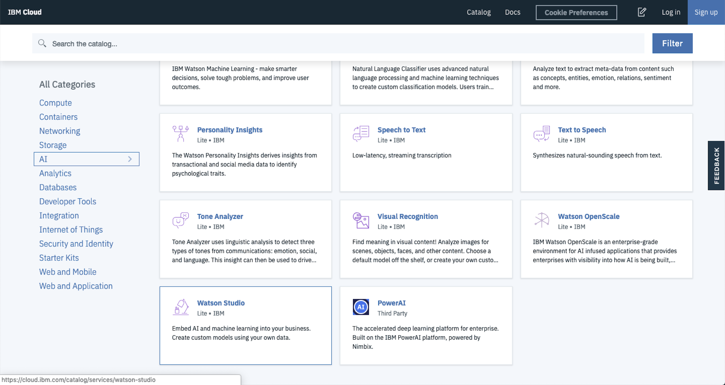
To get started, navigate to IBM Cloud, then select AI from the Category menu and finally select Watson Studio.
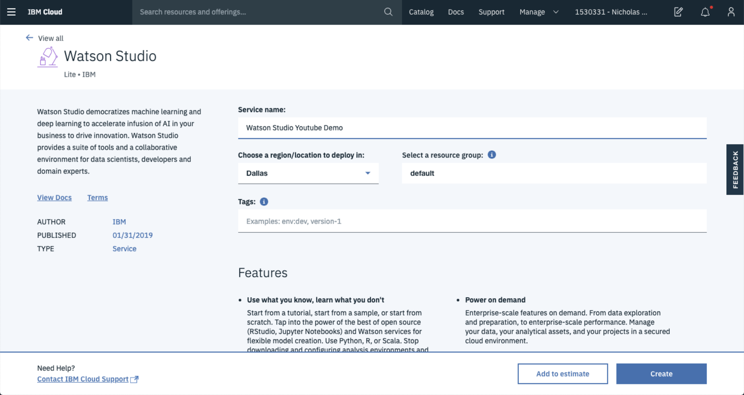
From here, you can name your environment and select the location you want your service located in.
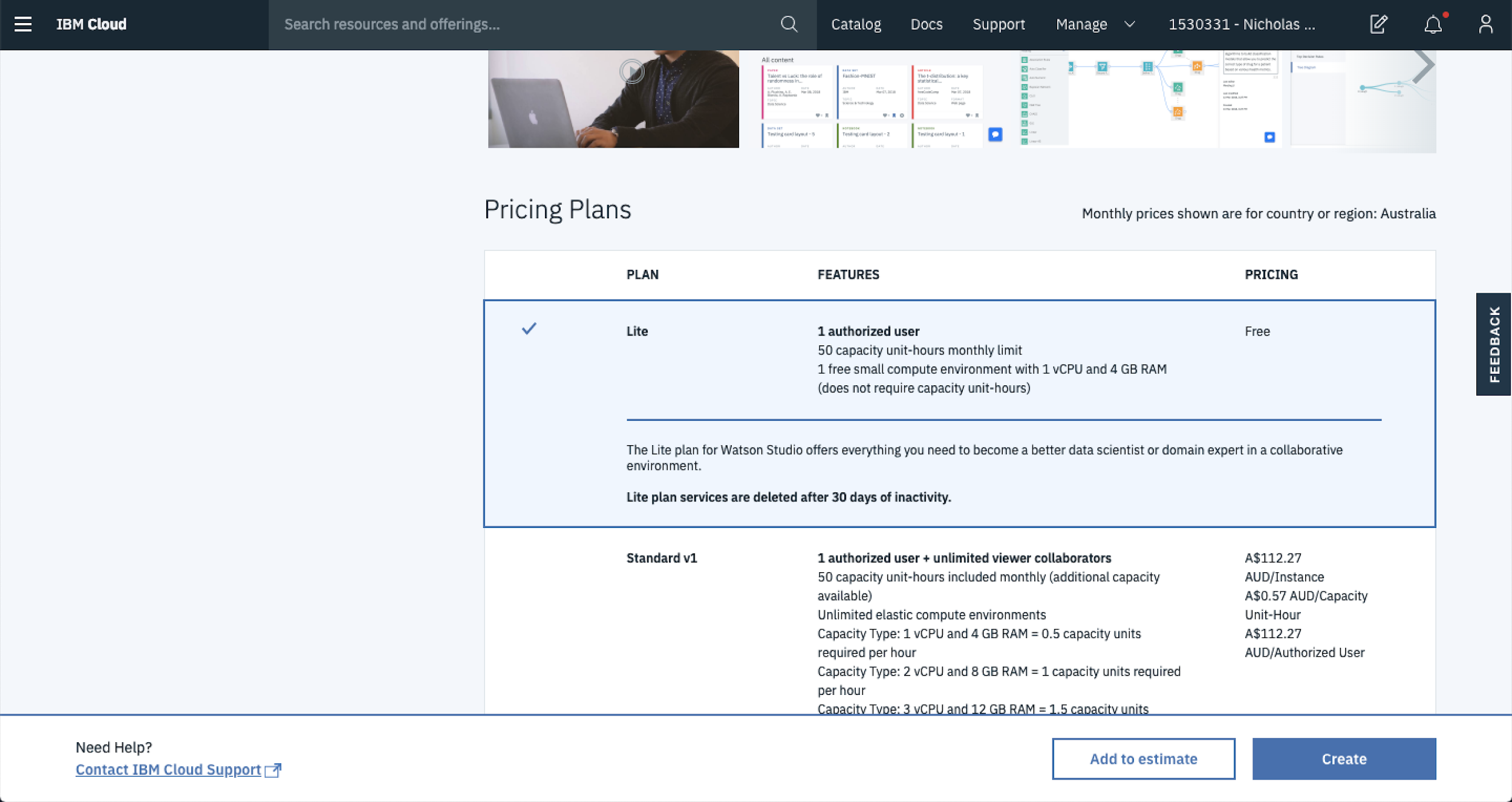
Once you’re done, scroll down the page to select the plan you’d like to use. If you’re just getting started, select the Lite plan. This is more than enough when you’re beginning your journey with Watson Studio plus it’s FREE.
After you’ve selected the plan for you, Hit Create to start up your the environment.
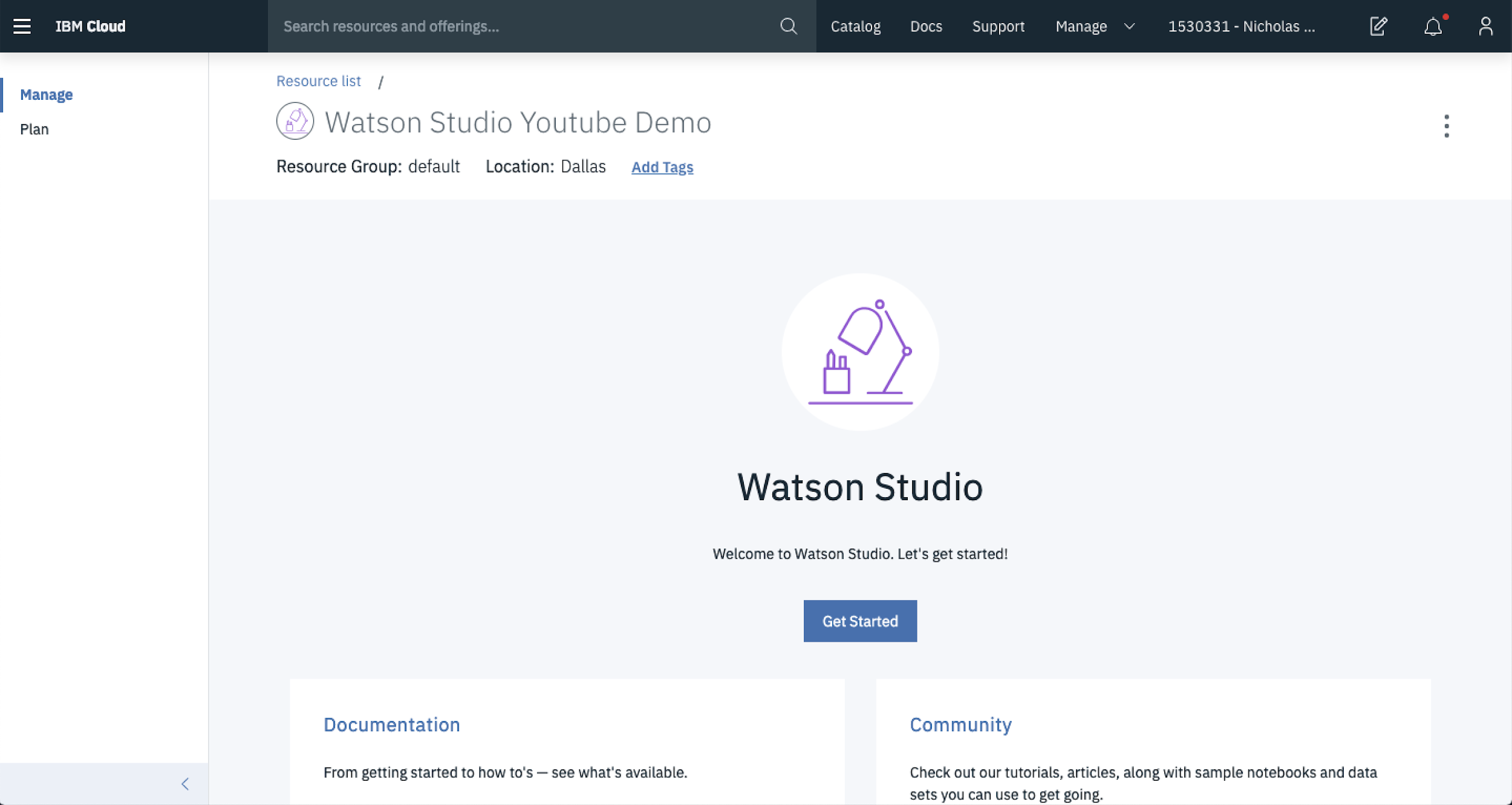
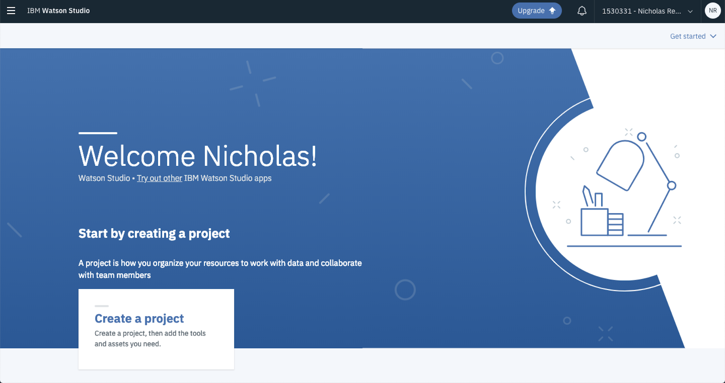
Assuming all is good in the Watson Studio world, you’ll be taken to a landing page that looks like this. Hit Get Started to keep plugging along.
Select Create Project once you get to here to start work on a new data science project.
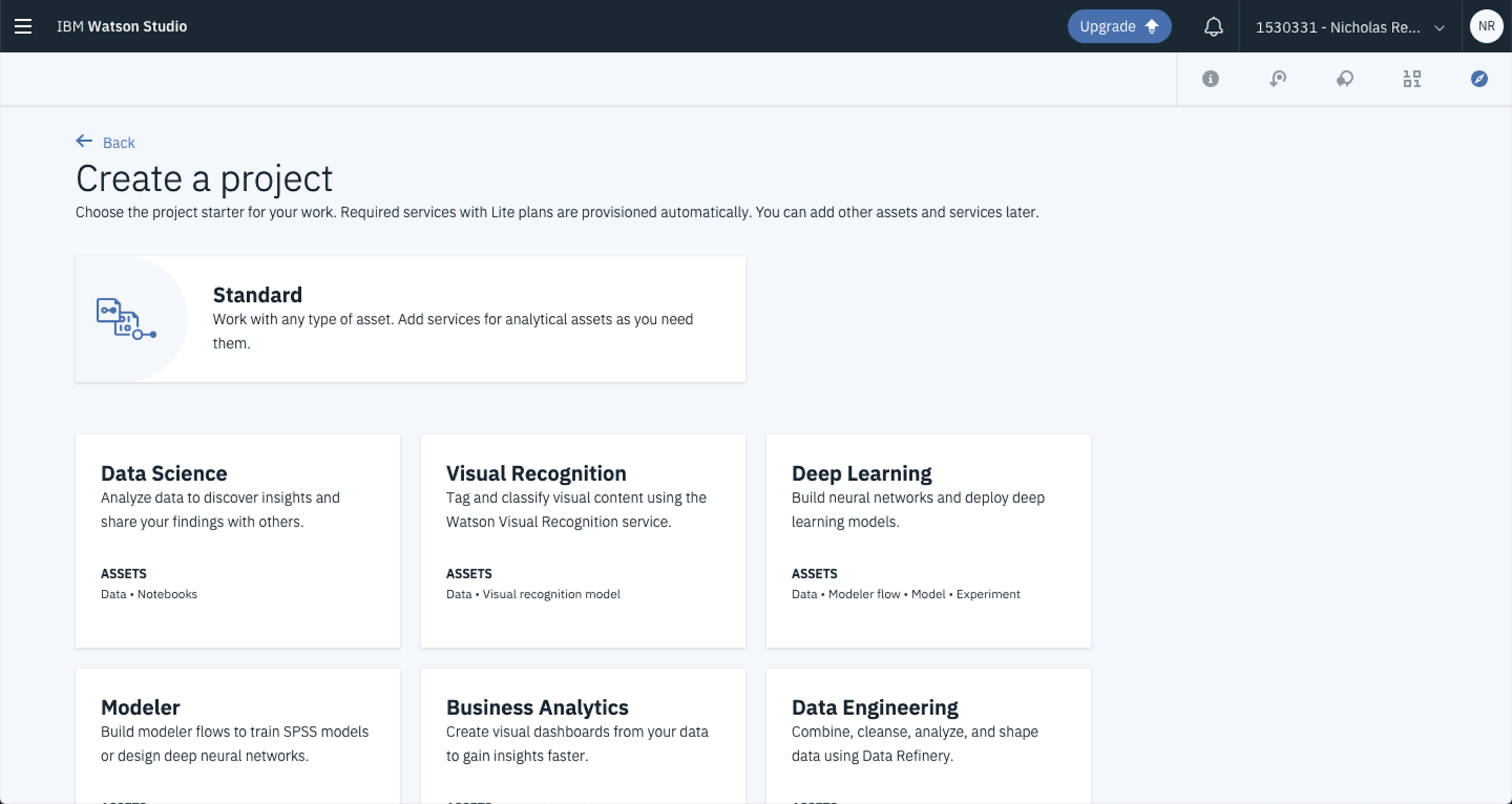
From here, you’ve got a few options for the type of project you’d like to start. We’re going to work with a standard project because we’ll spin up the services that we need as they’re required. But it’s good to know that these cookbooks are already there if you’re looking for a template or something to get started with. Hover over Standard and select Create Project.
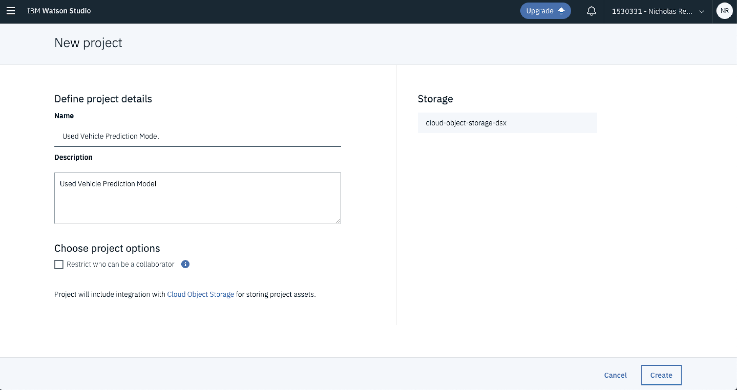
From here you can name your project and add a description. In this case, because you’re building a used car prediction model update the Name and Description fields to reflect that and hit Create.
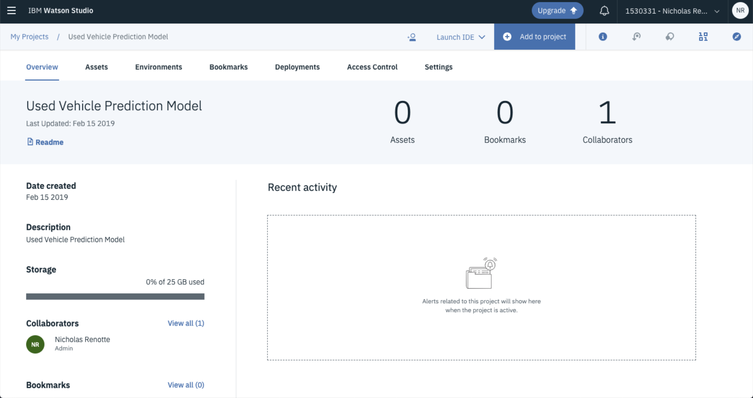
Boom…you have a project!
2. Adding and Visualising Data
Now any data science project wouldn’t be right without some data.
So in this step you’ll go through the process of adding and visualising the data that you’ll be working with. The data set that you’ll be working with is from Kaggle’s 1.2 Million Used Car Listings.
Download it and keep it somewhere easy to get to (like…not in your downloads folder, I kid save it anywhere).
From the project home page, click the Add to Project button and select Data.
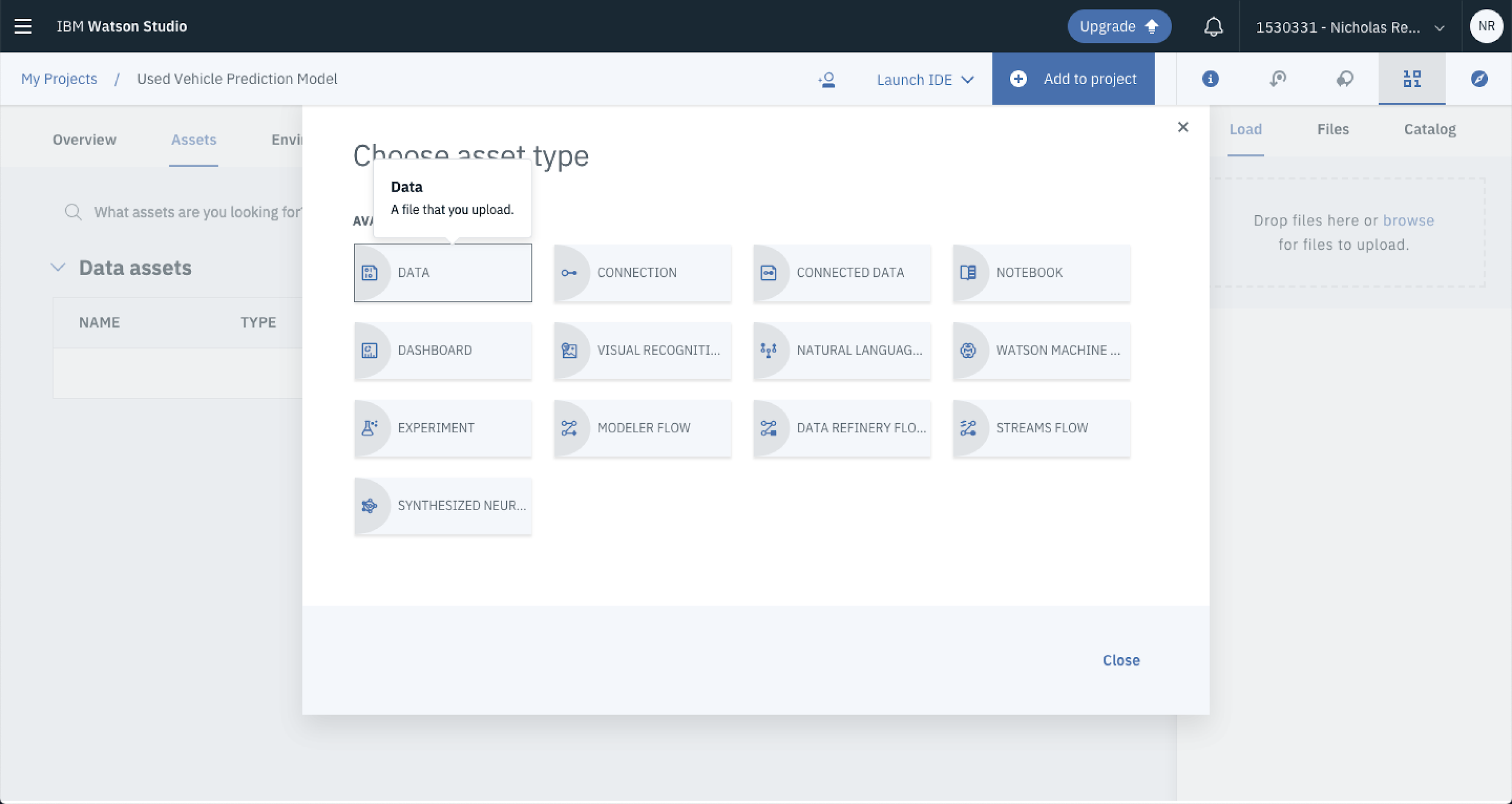
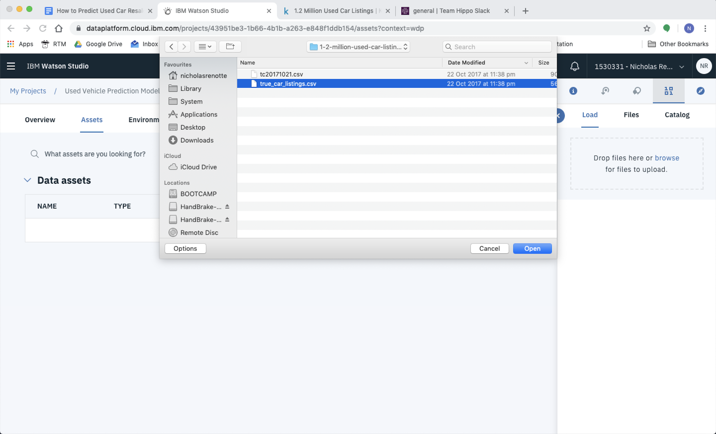
A popup tray will open up on the right side of your screen. Drag and drop the CSV onto the landing pad or alternatively select Browse to navigate through your folders to load it up.
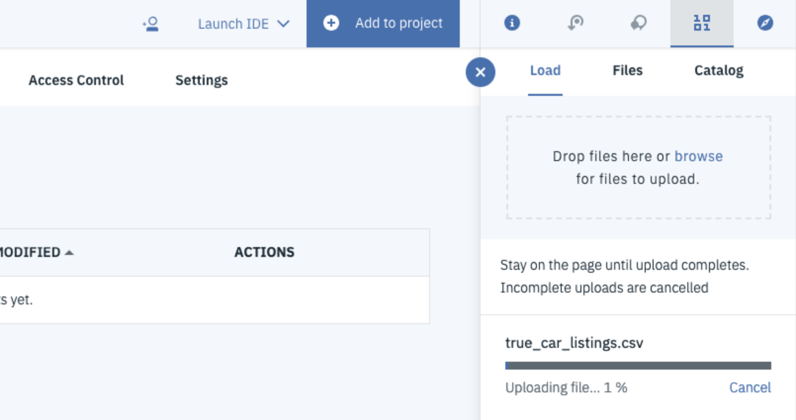
The file will then start uploading.
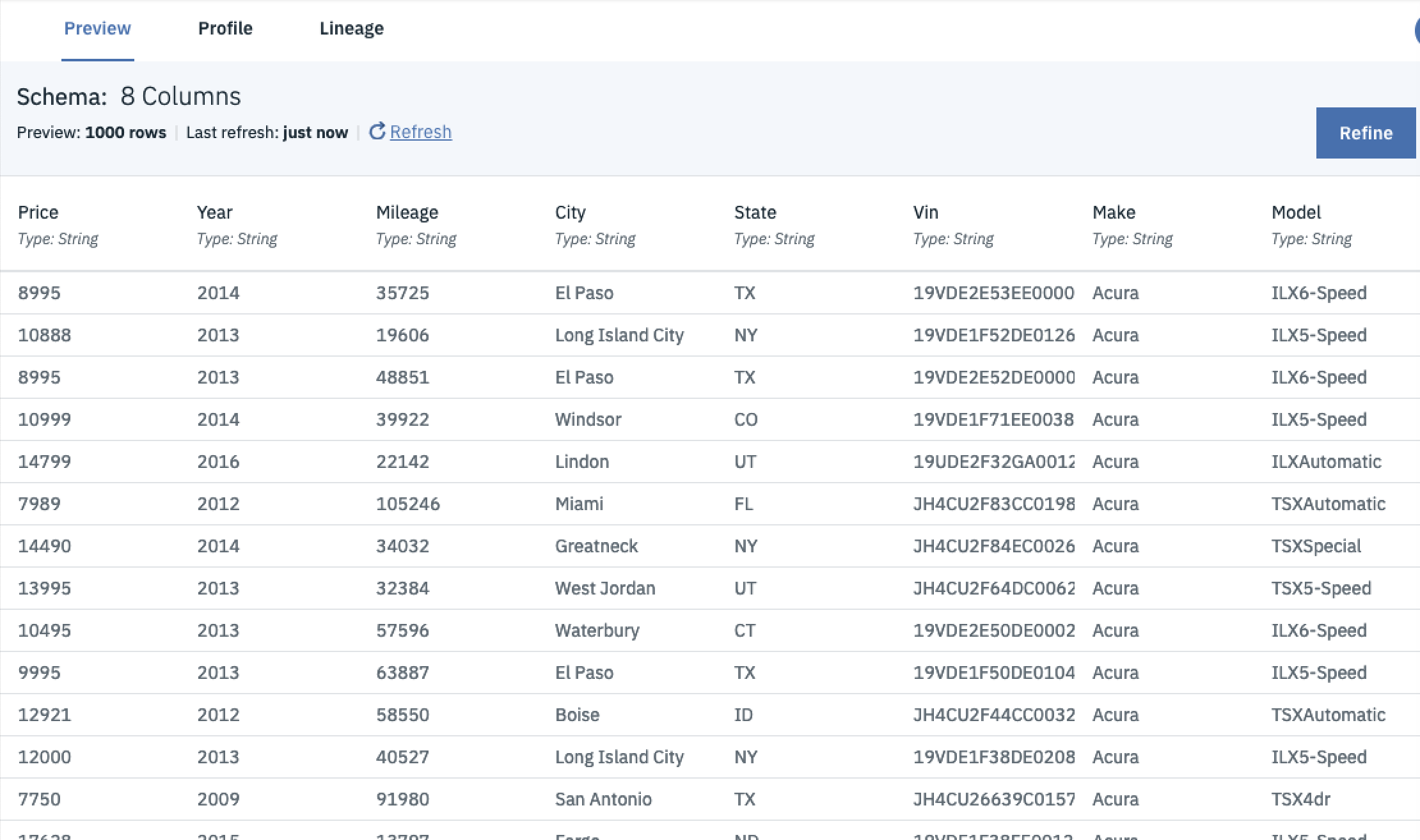
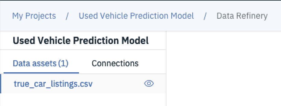
Once its done it should appear as a new data asset under the main page. You can see it here, its named true_car_listings.csv.

If you click on the file name, you’ll be taken to a page where you can preview your data. From here you can get a better idea of what you’re working with and the features available.
You can also select the Profile tab to create histograms and generate summary statistics for the first 5000 rows from the dataset.
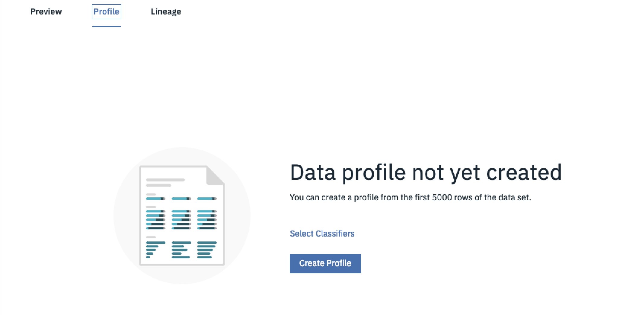
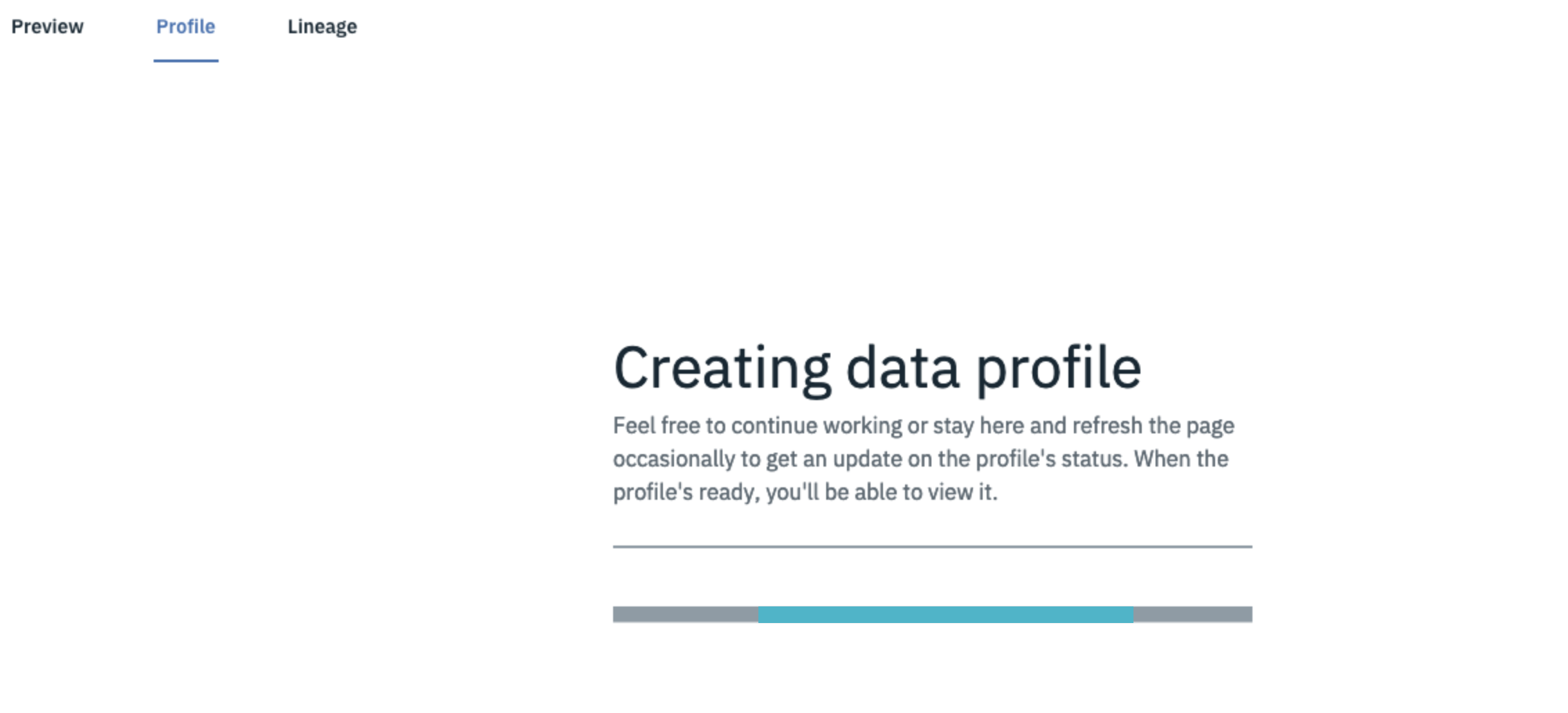
Select Create Profile to generate a profile of your data. Given just how big this data set is, this might take a few minutes while the profile is being created.
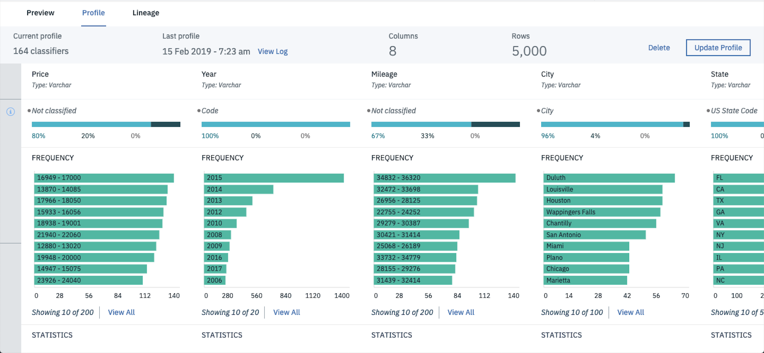
Once the profile is created you should be able to review the data profiles for each feature in the CSV.
If you scroll a little further down you’ll also be able to see a bunch of summary metrics including the unique feature count, min and max as well as the mean and standard deviation.
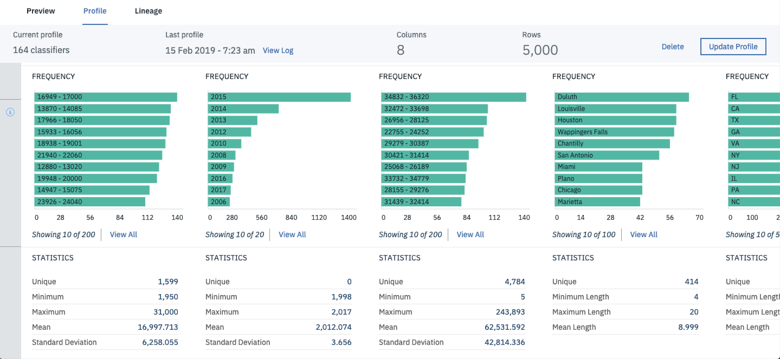
Important Note: It’s important not to make data cleaning and feature engineering decisions based on just this profile as it only displays summary statistics for the first 5000 rows of data.
To get better visualisations on the whole dataset its best to open up a notebook and filter through the data. In doing this you’ll be able to better visualise all observations in your dataset not just the first 5000 rows.
The cool thing is…you can do this all within Watson Studio. This is great if you’re working on a work computer and you’re not allowed to install Anaconda or Jupyter onto your local machine. To spin up a Jupyter Notebook from within Watson Studio select Add To Project and Select Notebook.
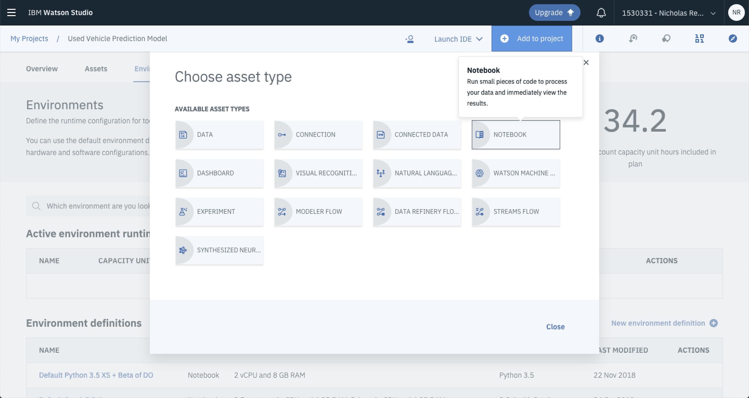
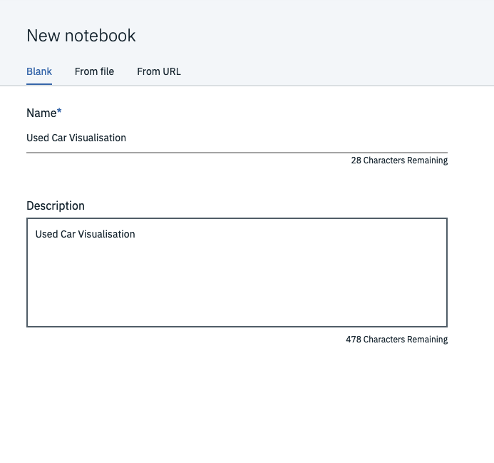
Update the Notebook Name and Description and Select Create Notebook.
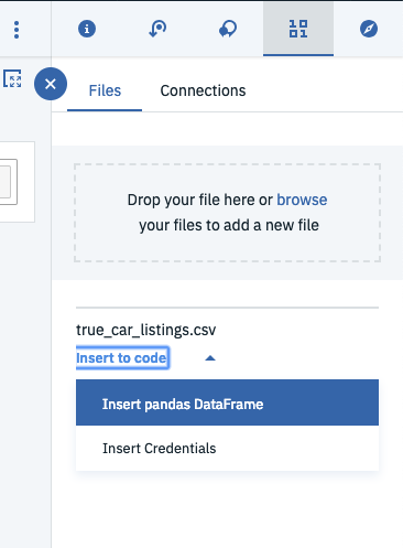
Once that’s all up and running you can begin adding data. The cool thing is that there’s a super easy way to add data that you’ve already got in your environment. Hit the IO button on the right side of the screen, select insert into code and click Insert pandas dataframe. This will automatically add a chunk of code into the currently selected cell and create a dataframe.
You can access the dataframe using the variable df_data_1.
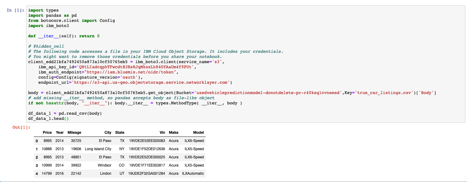
Let’s keep things a little consistent and create a new variable called df and set it to the already existing data frame named df_data_1 like so. This will mean less typing as you’ll be doing the majority of your analytical coding with the dataframe.
# Change variable name
df=df_data_1
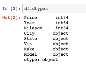
Now, you can mess around a bit and start visualising and analysing the data set. You can check the data types using the dtypes property.
# Display data types
df.dtypes
You should get a result that looks something like this.
You can grab some summary metrics by using the df.describe() method.
# Display summary statistics
df.describe()
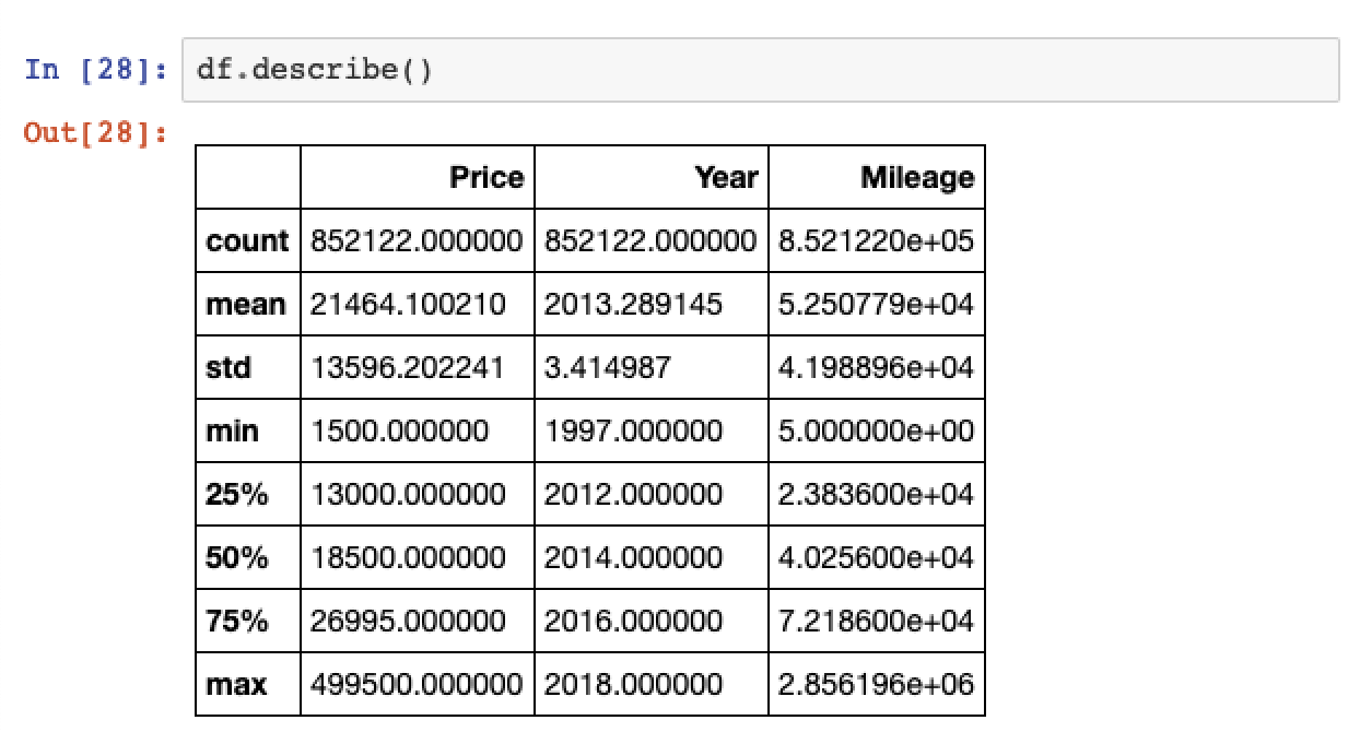
Note that you’re now working with the full 852,122 records in the dataset from the count metric shown above.
Data Cleaning Note: An interesting thing to note is that there are used cars up for sale that have on 5 miles of mileage. You can see this by taking a look at the minimum value shown in the Mileage column. This is an interesting thing to note as they’re probably not as used as most of the other cars in the list and may skew our model training. Ideally we’re probably looking for cars with over 1000 miles of mileage to focus our model on.
You can check how many cars full under this range by creating a boolean mask and filtering the dataframe.
# Count on cars with less than 1000 miles mileage
df[(df['Mileage']<=1000)].count()
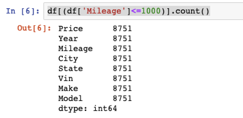
We’ll strip out these observations from our data set when it comes to data cleaning and prep.
You can also analyse the summary metrics for object data typtes by passing the include parameter.
# Summary metrics for object data types
df.describe(include=[‘object’])
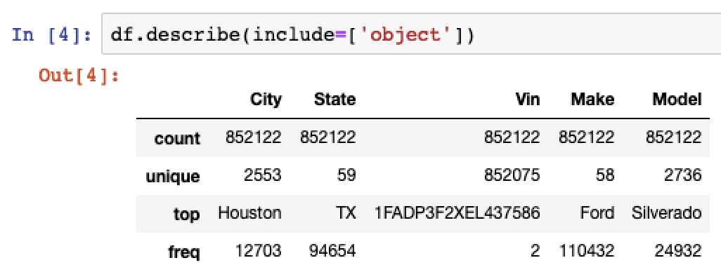
You can see from this that the majority of the cars in the data set are Ford Silverados. Also, the large majority of the cars up for sale are in Houston, Texas.
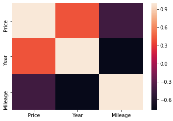
Rather than just sticking to tables and summary metrics you can spice up your analysis by taking a look into correlation and visualising it using heatmaps with the help of the seaborn module.
# Calculate correlation
df.corr()
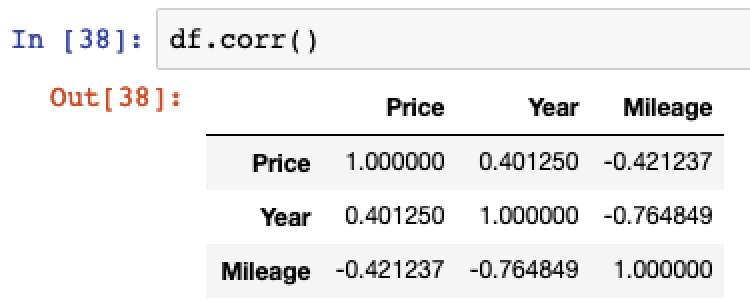
Then create a heatmap visualization.
# Import seaborn and matplotlib
import seaborn as sns
from matplotlib import pyplot as plt

# Create heatmap
sns.heatmap(df.corr())
# Render plot
plt.show()
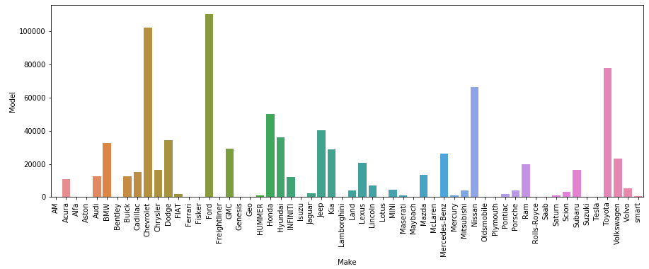
The last step that you’ll take to analyse your dataset is to visualise the frequency of different makes of used cars. Again you can use Seaborn to do this, however this time you’ll be grouping the dataset first by make and model and using a barplot to visualise.
# Group dataframe
makes = df[['Model', 'Make']].groupby('Make').count()

# Reset Index
makes = makes.reset_index()

# Resize plot
plt.figure(figsize=(15,5))

# Update axis rotation
plt.xticks(rotation=90)

# Create barplot
sns.barplot(y='Model', x='Make', data=makes)

# Render plot
plt.show()
Alrighty, that’s enough visualisation. It’s time for you to clean this up and start some modelling.
3. Cleaning and Feature Engineering
Now that you’ve got a better understanding of the data. It’s time to clean it up and prepare it for training. Watson Studio provides a service called Data Refinery that’s perfect for this task.
From there you’ll be able to clean your data and create features all with the click of a button. If you’re fond of coding in R, you can also use R functions to perform more complex data cleaning and feature engineering, you’ll run through one example of this below.
To setup a new Data Refinery service, select Add to Project and select Data Refinery Flow.
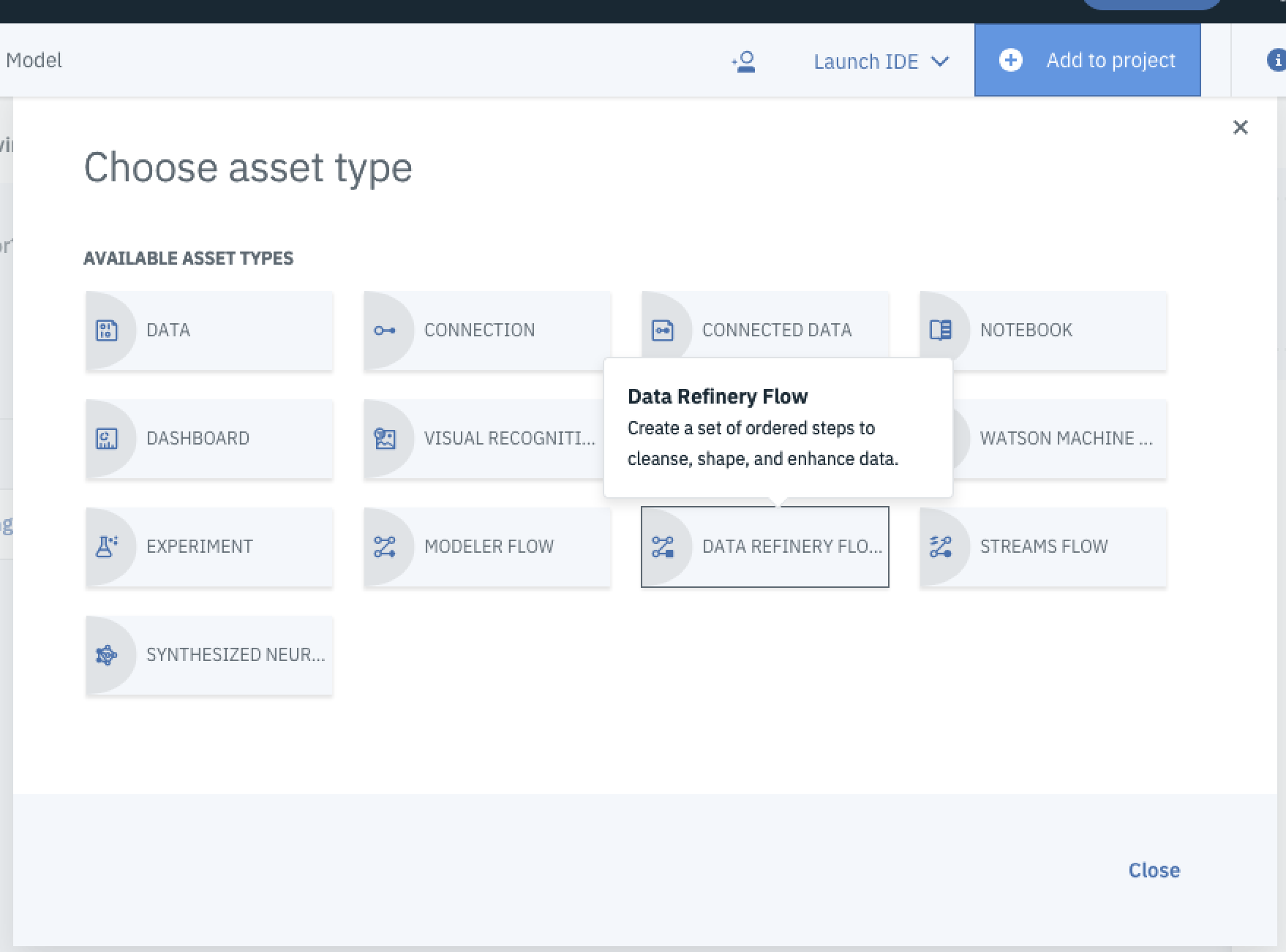
You’ll be redirected to the Data Refinery page. From here select your data source to get working with it and select Add.
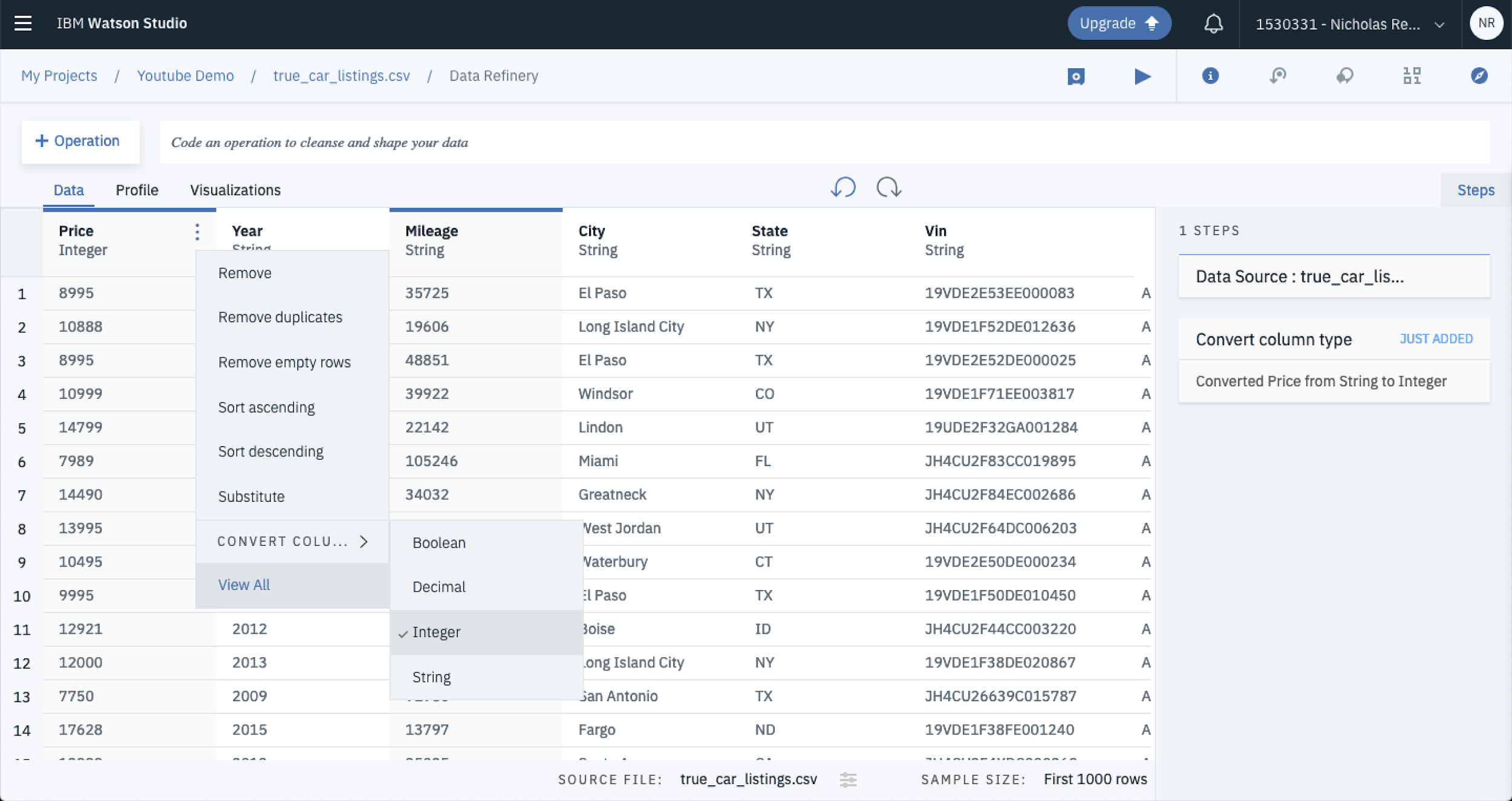
The first thing to do once you’ve loaded your data is to ensure the data types are correct, at an initial glance it looks as though the columns are all presenting as strings. You can change this by selecting the three dots that appear when you hover over the column title, then selecting convert column then selecting the data type you want. In this case we’ll convert Price, Mileage and Year to integers and leave the rest as strings.
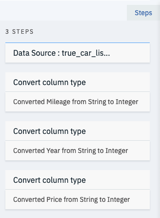
With each data cleaning step you’re able to see the pipeline steps to your right under steps. This allows you to keep track of the data preprocessing steps you’ve applied to your raw data set. You can also hover over a step and click the garbage bin if you want to remove a step for any reason.
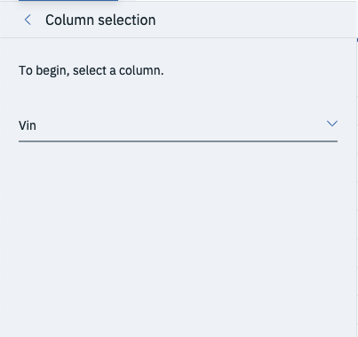
The VIN column is acting as a unique identifier and its highly unlikely that it will boost the performance of the final trained model. Rather than leaving it in, you can drop the column by selecting Operation and Remove and selecting the column you’d like to drop. In this case, drop VIN and hit Next and Apply.
Remember when you were analysing the data set you noticed that there were a number of cars with Mileage of less than 1000 miles?
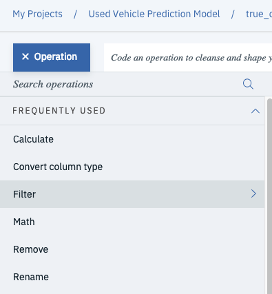
Well, you’re going to remove these as they likely represent newer’ish cars and will likely operate as outliers in the data set. You can use the filter operation to strip those cars out of the dataset. First select operation and then filter.
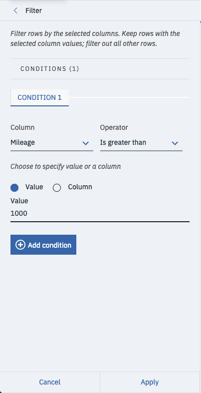
Then set the column to Mileage and change operator to is greater than. Finally, set the value to 1000 and select Apply at the bottom of the tray. This will cut out all records for vehicles that have less than 1000 miles.
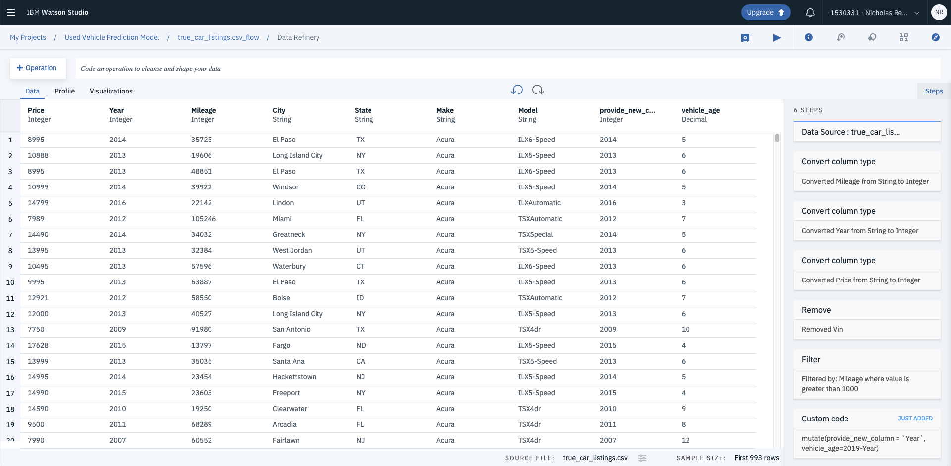
Rather than using the GUI you can also write functions in R if you’d like more flexibility. Say you wanted to create a new feature called vehicle age, you could use the mutate function to calculate roughly how old the vehicle is in years. Enter the code into the code bar and hit Apply.
# R - mutate data columns
mutate(Year, `Vehicle Age`=2019-Year)

This will create a new column called Vehicle Age.
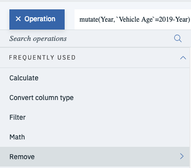
Because you now have an indicator for vehicle age, you’re able to drop the Year column by using the remove operation.
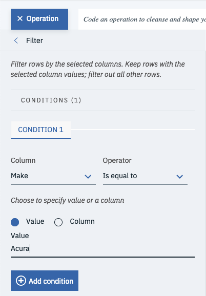
Finally, filter the model down to one make of car so that its a bit faster to train. In this case use the Operation function to filter out the data frame so that only Acura’s are left. Select Operation, then Remove, then change the column to Make, then change the operator to is equal to, enter the value as Acura and hit Apply at the bottom of the tray.
And this wraps up all the data cleaning and feature engineering you need to do.
You should now have 8 data refinery steps:
- Convert Mileage to Integer
- Convert Year to Integer
- Convert Price to Integer
- Remove VIN
- Filter the dataset to where Mileage is greater than 1000
- Apply a Custom Code function: mutate(Year, `Vehicle Age`=2019-Year)
- Remove the Year column
- Filter the dataset to where Make is equal to Acura
Last but not least, save the data refinery flow by clicking the button next to the play button.

Then run the flow by selecting the play button, and selecting Save and Run Flow on the next screen. (Side Note: You can change the output file name here if you want to).
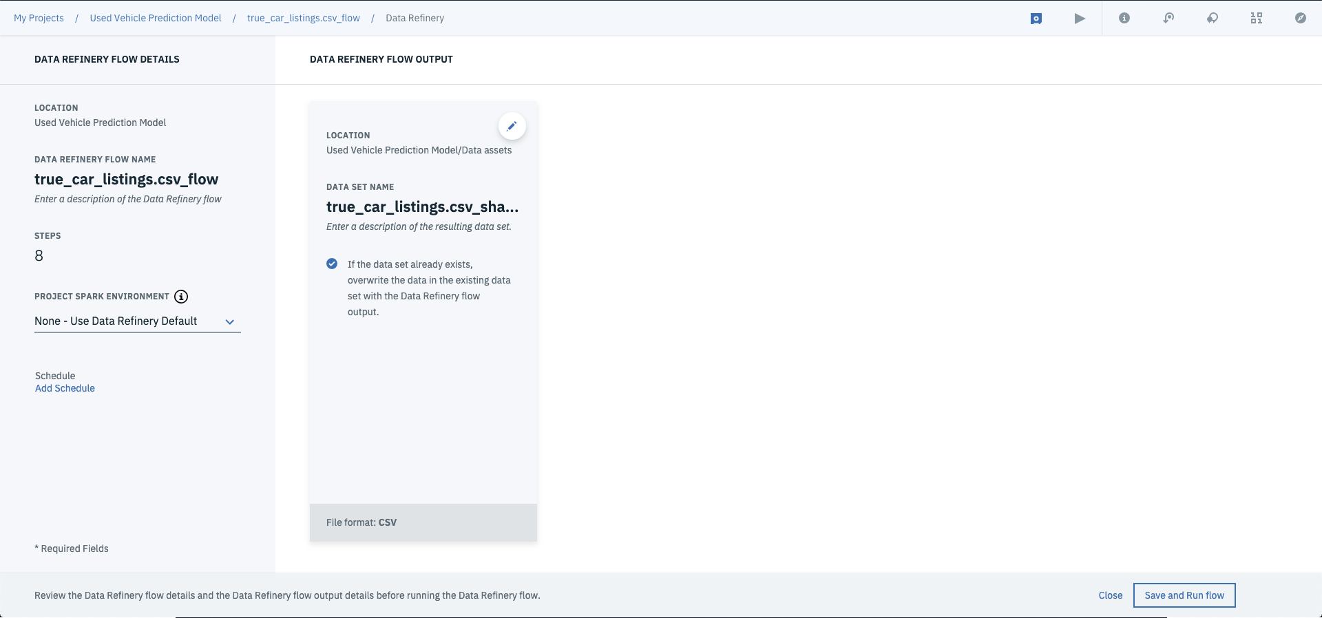
Once this is completed, you can save the flow and run it across your whole dataset by selecting run flow.

Once complete, you should have a reshaped data asset under your assets dashboard.

4. Creating a machine learning model
There are a few options here, you can go free form and create a notebook from scratch and build up your model that way. Or you can use the GUI and build up a model using the IBM Machine Learning Service. So that you can get your head around Watson Studio, these steps will go through the latter option.
First select New Watson Machine Learning Model.

Then enter in a Name and Description and select a machine learning service.
Side Note: If you don’t see any machine learning services available >> Click associate machine learning service > Hit Lite > Hit Create. You’ll be redirect to the new model screen. Hit reload down the bottom to associate your Machine Learning Service.
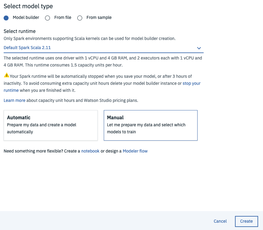
Next select Model builder, select your runtime, click Manual and hit Create.
From the Select Data Asset screen, choose the shaped csv (i.e. true_car_listings.csv_shaped.csv) that you created in step 3 and hit Next.

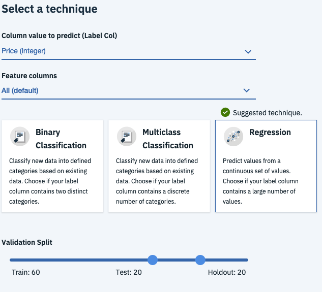
This is where you can choose your target variable and feature variables. The column to predict variable is the variable that you are trying to predict, given you’re predicting the price of the used car, set this to Price. The feature columns are all the columns that the model will use to to attempt to predict price, leave this as All so that the model can use all of the columns to train the model.
Machine Learning ELI5: There’s three model types available, Regression, Binary Classification and Multiclass Classification.
- Regression is typically used when you have a continuous target variable aka you’re trying to predict a number of something e.g. the price of a car, the value of a house, the level of sales for a company.
- Binary Classification is used to predict if something is true or not e.g. whether a customer is likely to churn, whether or not a customer is likely to default or whether an employee is likely to leave
- Multiclass Classification however is used when you’re trying to put something into a category e.g. classifying flower species, determining models of cars, determining classes of customers
In this case Price is a continuous variable, so select Regression as the model type and leave the validation split as is. (Side Note: this allows you to change how much of the data is used for training, testing and cross validation)
Next select Add Estimators and add all of the regression estimators available. These are different algorithms that are available to train the model, training against all of them allows you a better idea of which is likely to perform best.
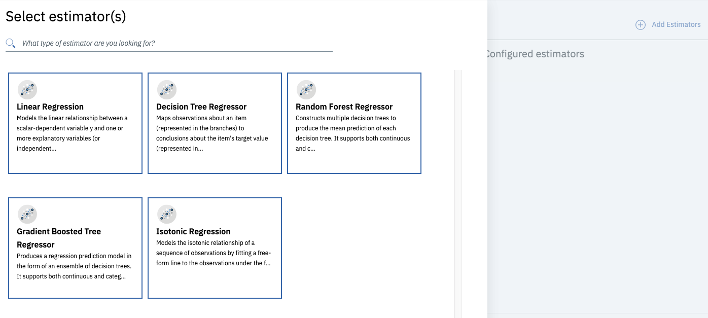
And hit Next to start the training process.
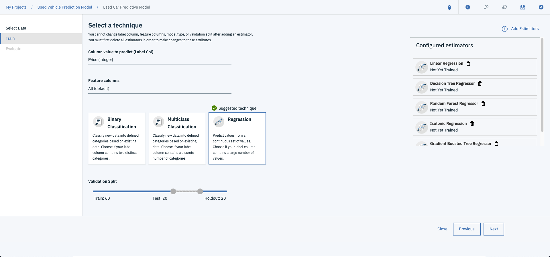
This will start training your models against all five of the regression algorithms (aka estimators). This may take some time so grab a cold one, sit back and watch the magic happen.

Once the models are trained you’ll be able to evaluate their relative performance.

In this case, Linear Regression performed best aour of all the models with the lowest Mean Squared Error and Mean Absolute Error and highest R2 and Explained Variance. Now that the model is trained, you can hit save and get on over to deploying it.

5. Deploying the Model Via REST API
Now that your model is trained and tested its time to set it free on the world aka deploying it. This will allow you to create predictions by making calls to the API.
After you’ve finished saving, hit the deployments tab.

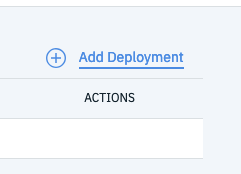
Select Add Deployment.
Name your new deployment and hit Save
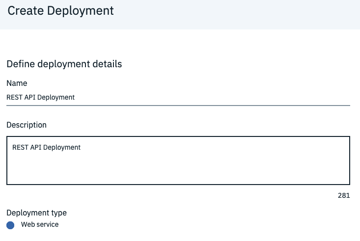
And that’s it…your model is deployed.

6. Making Predictions Using the Model Service
Now, the bit you’ve been waiting for….making predictions. Given the model is now deployed via a REST API, you can send requests to the service and get the predicted price of a used car (or a number of cars) back.
The first thing you’ll need in order to start predicting used car prices against your model is to grab the url for the REST API. This can accessed by clicking Deployments from the Watson Studio home screen.

And selecting your deployment, select implementation. Copy down the Scoring Endpoint URL you’ll need this when you start interacting with the API using Python.

In order to authenticate when connecting to the endpoint, you’ll need access your Watson Service credentials. You can grab these by clicking the burger menu at the top of any Watson Studio page and selecting Watson Services.
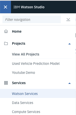
Then click on your service.
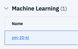
Select Service credentials.
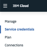
And select View Credentials

Copy down the username, password and url.
Now, you should have these four things:
- The scoring end point
- Your watson username
- Your watson password
- Your watson URL
For this next section you’ll be making requests using Python. You can use either a python script of work with Jupyter Notebooks for this. Given its relative ease of use I’d suggest spinning up a new Jupyter Notebook to get cracking on.
First up, import the required libraries. In this case, you’ll need urllib3 to form headers, requests to make requests and finally JSON to parse the response.
# Import libraries for requests
import urllib3, requests, json
Next, make a request to the IBM authentication service to receive an authentication token.
# Dict for credentials
wml_credentials={
"url": 'https://us-south.ml.cloud.ibm.com', # Enter your watson url here
"username": 'b4cb7bbc-2ff9-46dd-9942-4ddd47d04aa7', # Enter your watson username here
"password": '73d1b01a-58a2-4cac-bcc9-082acc3d9355' # Enter your watson password here
}

# Make headers for token request
headers = urllib3.util.make_headers(basic_auth='{username}:{password}'.format(\
username=wml_credentials['username'], password=wml_credentials['password']))

# Create url for token reques
url = '{}/v3/identity/token'.format(wml_credentials['url'])

# Request ML token
response = requests.get(url, headers=headers)

# Extract ML token
mltoken = json.loads(response.text).get('token')
header = {'Content-Type': 'application/json', 'Authorization': 'Bearer ' + mltoken}
Side Note: this code can be copied from the implementation page from the deployments page on Watson Studio.
You can then create a test data set that you’d like to use to predict.
# Demo data, needs to be in same format at shaped csv
values_to_predict = [54212, 'Miami', 'FL', 'Acura', 'TSX4dr', 3]
And create the payload to send to the deployment model service.
# Create payload
payload_scoring = {"fields": ["Mileage","City", "State", "Make", "Model", "Vehicle Age"], "values": [values_to_predict]}
Then update the model_url variable to the url for your deployment model (aka your scoring endpoint).
# Replace this with your endpoint URL
model_url = 'https://us-south.ml.cloud.ibm.com/v3/wml_instances/84d9986f-f343-4ed2-9654-ba21b50149a8/deployments/83ade9ce-b7bb-46fd-80f3-fe9d2daa5eff/online'
And FINALLY….make the prediction request.
# Make response
response_scoring = requests.post(model_url, json=payload_scoring, headers=header)
You can then print out the entire json response.
# Display response
response_scoring.json()
Which should look something like this….
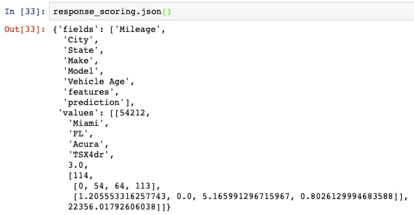
Or print out the final result…

And there you have it, how to build and deploy a used car prediction model from start to finish.
Just to recap how far you’ve come, you’ve now gone through:
- How to load, clean and feature engineer data
- How how to train and evaluate different models
- Finally how to deploy your trained model via a REST API
Go you! If you didn’t walk through this whilst reading, go on now, give it a try!!
Happy coding!
