It’s like nothing you’ve ever seen before. It’s fascinating how long it’s holding your attention. There’s so much to grasp. So much to digest. You start to wonder how on earth they managed to create it.
What tools did they use?
Where did their inspiration come from?
And finally,…how can I make one just like it?
These are the exact thoughts that ran through my mind when I started searching for some of the more exotic data visualizations across the web. I discovered that there’s an underground community of data viz engineers that are changing the world one visualization at the time.
There’s one common thread which runs through them all. They all use (or have used) d3 to create some or all of their visualizations. d3 is the gold standard for data visualization and DOM (the stuff on a single web page) manipulation.
If you’re going to become a data viz wiz…you need to learn how to use it.
Follow the crash course below and you’ll get up to speed in no time!
1. Understanding the DOM
D3 is a javascript package. That means that the rendering of your visualizations are going to be done in your browser. Specifically you’re going to be changing the DOM aka Document Object Model. This is the structure that your browser creates when you load a web page.
It looks a little like this.
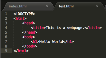 This is the same structure that all websites use across the web. This structure can be updated to render visualizations using d3 by changing what’s in each HTML tags.
To make your life a little easier, I’ve set up a HTML template that you can use for this tutorial. Which you can download here >> D3 Blog Post. To start using the template, open a new terminal window and run python -m SimpleHTTPServer. Then navigate to the folder from your browser.
If you haven’t done much web development it’s probably a good idea to do a little reading before diving head first into this crash course. There are some brilliant free resources around the web (as well as some pretty decent paid ones). Codeacademy has a HTML & CSS course which provides a solid grounding in the concepts you’ll need here.
2. Creating SVGs
The first part of creating any visualization using d3 is to create an SVG. Think of this as a canvas for laying out all of your visualization components. When you strip back all the fancy stuff, a visualization is just a bunch of shapes that are sized and positioned differently based on the information that underlies it. That’s exactly how d3 works.
Before actually creating an SVG we need to tell d3 where within the DOM we want to create it. In this case, the SVG element will be created within the div where the id =”blanksvg” in the template HTML file.
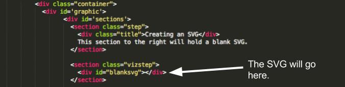
To select this particular div we can use the d3 select method. For the first SVG we want to select the div with ID blanksvg so it will look like this.
// Select a div using an ID
d3.select("#blanksvg")
Now that you’ve selected the div you’ll need to insert an SVG element. To do this we’ll use the d3 append method to append an SVG into the blanksvg div.
// Appending an SVG
d3.select("#blanksvg")
  .append("svg")
Finally, you’ll want to set the dimensions for the SVG. This can be done by using the attr method (short for attribute). To set the width and height you can pass through each of these parameters directly or use separate variables for later reuse.
To set the width and height, first create two separate variables to hold the values.
// Set width
var width = 640;
// Set height
var height = 250;
Then pass these values into the attribute method
// Set height and width attributes for #bar SVG
d3.select("#blanksvg")
  .append("svg")
  .attr("width", width)
  .attr("height", height)
We can reuse this selection by storing it in as a variable. This allows us to load/draw other elements within the SVG at a later stage.
var bar = d3.select("#bar")
  			.append("svg")
  			.attr("width", width)
  			.attr("height", height)
3. Drawing shapes
d3 makes it super easy to draw shapes. It’s especially powerful because you’re able to bind data to a shape to affect how it looks, its size, etc.
Say you wanted to draw a rectangle. You would first select the SVG that you wanted to insert the rectangle into. In this case the div with an id of shapes and selectAll rectangles in that div.
var shapes = d3.select("#shapes")
		.append("svg")
		.attr("width", width)
		.attr("height", height)

shapes.selectAll("rect")
Then bind data (in this case the value 1) to that shape/s.
shapes.selectAll("rect") //
		.data([1])
		.enter()
		.append("rect")
And update the attributes for that particular shape.
shapes.selectAll("rect") //
		.data([1])
		.enter()
		.append("rect")
		.attr("height", 50)
		.attr("width", 10)
		.attr("x", 10)
		.attr("y", 10)
		.attr("fill", "red")
If you have no idea what just happened, fear not. I’ll walk through it in more detail in the next steps.
4. Binding Data
In order to illustrate the next couple of functions you’ll use all of the basic d3 methods to put together a bar chart and a scatterplot. Now…onto binding data.
The simplest form of data that can passed through to d3 is an array. This is the data that will be used for the first bar chart.
var bardata = [50,100,120,30,230,60,40];
Cast your mind back to my oversimplied explanation of visualisations…
“…a visualization is just a bunch of shapes that are sized and positioned differently based on the information that underlies it”
This next block is what actually binds the data from our bardata array to the shapes in the visualisation. For a bar chart the shape that you’ll need to map the data to is a simple rectangle (similar to what you did above).
First, create an SVG to hold the bar chart then select all of the rectangles within that SVG.
var bar = d3.select("#bar")
	    .append("svg")
	    .attr("width", width)
            .attr("height", height);

bar.selectAll("rect")
Then bind the data using the data and enter methods. The enter method is what signals that there is data being added and to perform the following methods in the chain for each data point.
bar.selectAll("rect")
	.data(bardata)
	.enter()
Just as you appended the SVG to the bar div above, you’ll need to append a new rectangle for each data point in the bardata array to the svg. Keep in mind that we’re already working with the right SVG as we’ve used the variable bar before our selectAll method. All that’s left to do is append the rectangles.
bar.selectAll("rect")
	.data(bardata)
	.enter()
	.append("rect")
If you try to display code above in your browser you won’t actually see anything. This is because we haven’t passed any additional attributes to the rectangle. Right now, it’s just a blank rectangle without height, width or coloring.
Up until now, you’ve dealt with one element at a time. For example you updated attributes for the SVG and selected the bar div. But now we’ll need to deal with each rectangle in the visualization individually so that the attributes (e.g. height and position) are specific to each bar.
To do this we can use anonymous functions. This is one of the huge selling points for d3. It makes dealing with large data sets a breeze. There are two anonymous variables created when you use the data method. The first is d which represents the value from the dataset. The second is i which represents the datapoint number.
For example in the bardata array:
– d would represent the values 50,100,120,30,230,60,40
– i would render the series: 0,1,2,3,4,5,6
Using d3 we can iterate through each data point by using anonymous functions.
// This is the basic structure of a d3 (javascript) function.
function(d){
	return d;
}

// Using i
function(i){
	return i;
}

Using d and i
// Using i
function(d,i){
	return d;
	return i;
}
5. Using Anonymous Functions to Loop Through Data
Anonymous functions need to be used inside of an existing d3 chain which contains the data method. To create a bar chart, you’ll need to set the width, height, x, y and fill attributes.
x and y refer to the location of the rectangles.
For a bar chart the x value could refer to an ordinal scale but for this example, it’s equal to the width of the svg divided by the number of data points in the bardata array multiplied by the bar number (i). The length of the bardata array is accessed by grabbing the .length attribute.
.attr("x",function(d,i){
	return width/bardata.length*i;
})
d3 treats y coordinate space in a slightly different way. The y axis begins from the top of the page rather than from the bottom.
For this reasonthe y value is equal to the height of the SVG minus the height of the bar.
.attr("y",function(d){
	return height - d;
})
The height of each bar is equal to the data point value i.e. d.
.attr("height",function(d){
	return d;
})
The width of each bar is just equal to the width of the SVG divided by the number of bars – some padding (2);
// bar width
.attr("height",function(d){
	return width/bardata.length - 2;
})
The final section of code sets the fill attribute of for each bar.
	.attr("fill", function(d){
		return "rgb(0,0," + d + ")";
	});
This is done by dynamically calculating the RGB color code based on the bar value (d). The first bar would return an rgb color code of rgb(0,0,50).
Putting this all together you should get something that looks like this.
bar.selectAll("rect")
	.data(bardata)
	.enter()
	.append("rect")
	// x coorindate
	.attr("x",function(d,i){
		return width/bardata.length*i;
	})
	// y coorindate
	.attr("y",function(d){
		return height - d*10;
	})
	// Bar width
	.attr("width", function(d,i){
		return width/bardata.length - 2;
	})
	// Bar height
	.attr("height",function(d){
		return d*10;
	})
	// Fill color
	.attr("fill", function(d){
		return "rgb(0,0," + d + ")";
	});
Side Note: For a complete list of shapes check out Mike’s github repo.
6. Creating Scatter Plots with Random Data
Believe it or not scatter plots work much the same way as the bar chart above. The main difference is that rather than dealing with rectangles you’re working with circles and rather than working with a regular array of individual values you’ll use tuples (sets of two data points i.e. x and y coordinates).
Rather than using a static data set like bardata above let’s create a random data set. (This will come in handy to demonstrate transitions). The built in javascript Math functions come in handy here. Spefically we’ll use Math.random() to generate a new random number.
Say we want to create a set of 25 random tuples (sets of two values). We could use the d3 range function to create a set of 25 values (1-25).
d3.range(25)
Then for each of those values we could use the map function to load the data into a new array. (Note the square backets.)
d3.range(25)
  .map(function(){
  	return[Math.random()*10 , Math.random()*10];
	})
This entire dataset is then mapped to a variable called scatterdata which can be passed the data method later on when appending circles.
var scatterdata = d3.range(25)
					.map(function(){
						return[ Math.random()*10 , Math.random()*10 ]; // Note the square brackets
					})
Just like before create an SVG to load our visualization into. This time the div has an id of scatter.
var scatter = d3.select("#scatter")
				.append("svg")
				.attr("width", width)
				.attr("height", height);
When creating our bar chart we loaded the exact data values and used them to set the height. There’s one main issue with this. If the values in the dataset are larger than the size of the SVG (width and height) then parts of the visualization won’t be visible as they will be outside the SVG area.
To get around this d3 uses scales. In this case we’re using the scaleLinear function to resize our data so that it fits within the scatter SVG. There are two key methods that are needed; domain – the range of input values and range – the range that we want to specify for our output
Just remember the following and you’ll be fine.
– Input -> domain
– Output -> range
scaleLinear is a d3 function so it can be accessed like this.
d3.scaleLinear()
We’ll need to create a separate scale for x and y values as we’ll need to map these to the maximum height and width of the scatter SVG. To create the x scale, store the scale in a new variable called xScale.
var xScale = d3.scaleLinear()
Then chain the domain and range methods.
var xScale = d3.scaleLinear()
				.domain()
				.range()
When setting the x scale or y scale for a scatter plot the domain should correspond to the minimum and maximum values within the data set. To do this we can use the d3.min and d3.max functions to return the minimum and maximum values respectively.
We can use anonymous functions to pass through an array of values to the min function. Now that we’re using an array of tuples we need to access the x coordinate, this is the first value in each tuple hence it’s accessed by arrayname[0]. The y coordinate is the second value; arrayname[1]. Because we’re using an anonymous function the array in question is d. To grab the x coord we use d[0].
d3.min(scatterdata, function(d){
					return d[0];
						}
Then pass it through to the scaleLinear function, along with some adjustments for padding.
var padding = {
	left: 5,
	right: 5,
	top: 10,
	bottom: 10
};

var xScale = d3.scaleLinear()
				.domain([d3.min(scatterdata, function(d){
					return d[0];
				}),d3.max(scatterdata, function(d){
					return d[0];
				})])
				.range([0+padding.left + padding.right,width-padding.left - padding.right]);
We can do something similar with the y scale by updating using the y values.
var yScale = d3.scaleLinear()
			.domain([d3.min(scatterdata, function(d){
				return d[1];
			}),d3.max(scatterdata, function(d){
				return d[1];
			})])
			.range([0+padding.top+padding.bottom,height-padding.top-padding.bottom]);
To display the scatter plot we can follow the same rendering sequence that was used for the bar chart.
1. Select the SVG > scatter
2. Select All the shapes that need updated > .selectAll(“circle”)
2. Bind data .date(scatterdata)
3. enter()
4. Append the shapes > .append(“circle”)
5. Update attributes
The main attributes that are needed for a scatter plot are cx, cyand r. These correspond to the x and y coordinates and the circle radius respectively.
scatter.selectAll("circle")
		.data(scatterdata)
		.enter()
		.append("circle")
		.attr("cx", function(d,i){
			return xScale(d[0]);
		})
		.attr("cy",function(d){
			return yScale(d[1]);
		})
		.attr("r",10)
		.attr("fill", function(d){
			return "rgb(0," + d3.format(".0f")(d[0]*50) + "," + d3.format(".0f")(d[1]*50) + ")";
		});
7. Working With Transitions
One of the most awesome parts of d3 is the interactivity that comes along with using the library. Once you get the hang of it, it’s actually relatively straightforward to do. Say we wanted to print a message to the log each time a user selected one of the circles from the scatter plot. We could do this using an event listener, it’s pretty much jargon for if the user does something to the page then do something else. In this case the event listenter would be click as we’re expecting the user to click a circle in the scatter plot.
d3.selectAll("circle")
	.on("click", do something here)
We can then trigger a callback function to log something out (to log out in javascript use console.log(whateveryouwanttologhere)…it’s a lifesaver).
d3.selectAll("circle")
	.on("click", function(){
	console.log("user clicked circle")
})
We could also use this to update the data for the scatter plot. The general gist of this is that anything that needs to be updated can (and should) go inside of the callback function. I.e. the dataset itself, scales and the rendering.
The only difference is that we exclude the enter and append methods from the rendering sequence as this is an update. So the rendering looks like this rather than the same sequence as before.
scatter.selectAll("circle")
		.data(scatterdata)
		.attr("cx", function(d,i){
			return xScale(d[0]);
		})
		.attr("cy",function(d){
			return yScale(d[1]);
		})
		.attr("r",10)
		.attr("fill", function(d){
			return "rgb(0," + d3.format(".0f")(d[0]*50) + "," + d3.format(".0f")(d[1]*50) + ")";
		});
We can also add a touch of animation by using d3’s transitions. The duration allows you to change how long the transition takes.
scatter.selectAll("circle")
		.data(scatterdata)
		.transition()
		.duration(1000)
		.attr("cx", function(d,i){
			return xScale(d[0]);
		})
		.attr("cy",function(d){
			return yScale(d[1]);
		})
		.attr("r",10)
		.attr("fill", function(d){
			return "rgb(0," + d3.format(".0f")(d[0]*50) + "," + d3.format(".0f")(d[1]*50) + ")";
		});
Putting it all together, the update block should look like this. Now, when a user selects an individual circle the graph should transition smoothly using the new dataset.
d3.selectAll("circle")
	.on("click", function(){

		// Regenerate the data
		var scatterdata = d3.range(25)
					.map(function(){
						return[Math.random()*10,Math.random()*10];
					});

		// Create a new x scale
		var xScale = d3.scaleLinear()
				.domain([d3.min(scatterdata, function(d){
					return d[0];
				}),d3.max(scatterdata, function(d){
					return d[0];
				})])
				.range([0+padding.left + padding.right,width-padding.left - padding.right]);

		// Create a new y scale
		var yScale = d3.scaleLinear()
				.domain([d3.min(scatterdata, function(d){
					return d[1];
				}),d3.max(scatterdata, function(d){
					return d[1];
				})])
				.range([0+padding.top+padding.bottom,height-padding.top-padding.bottom]);

		// Render the visualization
		scatter.selectAll("circle")
			.data(scatterdata)
			.attr("cx", function(d,i){
				return xScale(d[0]);
			})
			.attr("cy",function(d){
				return yScale(d[1]);
			})
			.attr("r",10)
			.attr("fill", function(d){
				return "rgb(0," + d3.format(".0f")(d[0]*50) + "," + d3.format(".0f")(d[1]*50) + ")";
			});
	})