Don’t you hate it? You’re just casually flicking through a glossy publication.
Then BAM!
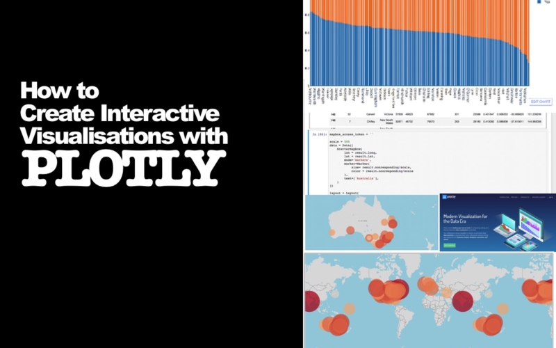
An amazing visualisation just jumps right out of the screen. It looks awesome. You think to yourself “Woah, i wish i could create stuff like that!”
Truth is…
You can!
Say hello to Plotly. It’s the easier-to-use version of the super-viz-package d3.js. It seamlessly integrates with Python and Jupyter Notebooks and allows you to create stunning visualisations ridiculously quickly.
Want to give it a go? Keep scrolling and follow the steps below.
1. Install Plotly
In order to use Plotly for the first time, you need to ensure you have the Plotly package installed. These install procedures assume you’re using Plotly inside of Jupyter notebooks and that you’re coding in Python.

To install Plotly just navigate to your terminal or command line and install using the pip command:
pip install Plotly
Before using Plotly you’ll need to set up an account so that you can access the Plotly API. To do this, go to the Plotly home page and create an account.
Once you’ve done that you should be able to access your API key here >> https://plot.ly/settings/api
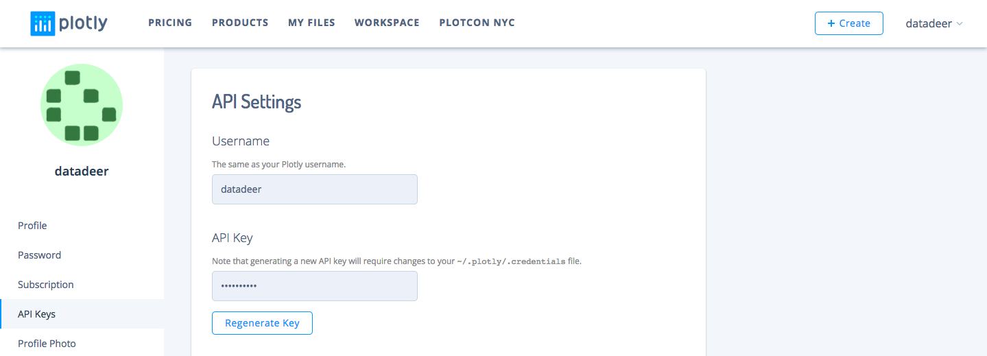
Copy down your username and API key. You’ll need it to set up the first time you use Jupyter. Launch a Jupyter notebook.
The first time you use Jupyter you’ll need to complete this setup step, after that you’ll be able to run free through fields of visualisations. To set it up, import the package…
import plotly
and pass through your credential like so.
plotly.tools.set_credentials_file(username='DemoAccount', api_key='lr1c37zw81')
Remember to change your username to your account username and your api_key to the API key that you copied down.
2. Import the required libraries
In this case, I’ve just included the ones we need, for now, I’ve got a bit of a bad habit of lumping them all in at the top of my notebook. For this, we’re going to need pandas, potentially numpy and a few of the Plotly modules. Import your libraries like so:

3. Get data
To make life a little bit easier I’ve committed the required data sets to github so that they can be imported using the raw link. This means you won’t need to mess around with file paths on your computer etc.

These are three data sets that we’ll be using. We’re going to import these as Pandas Data Frames to make our lives a little bit easier. If you haven’t worked with data frames before fear not you’ll pick it up in a breeze.
4. View the data frame
It’s always a good idea to take a quick look at the data you’re working with. Typically I’d use the .head() and .tail() functions to get the first five and last five rows. But for this we’re going to go all out and use plotly figure factory tables. They’re a little prettier than your bog standard output and they load all rows by default.
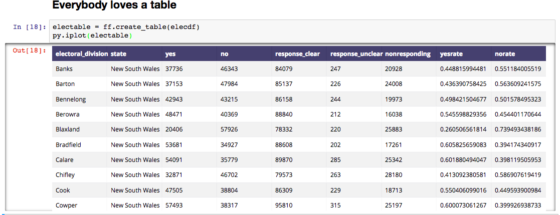
5. Start plotting
Analyse the proportion of yes votes vs. no votes by creating a quick feature and storing the results in a new column. The first block of code creates two new columns in our data frame that holds the percentage of voters that voted yes and the percentage that voted no. (Keep in mind that this excludes people that didn’t vote and provided null votes.
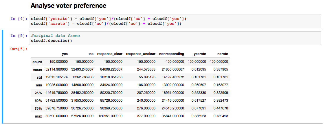
Before we start plotting it’ll make our life easier if we have a dataframe that’s already sorted based on the values we’d like to analyse.

Create a plot of yes votes based on electorate. The actual plotting isn’t too many lines of code. It’s data preparation that tends to take the most time.
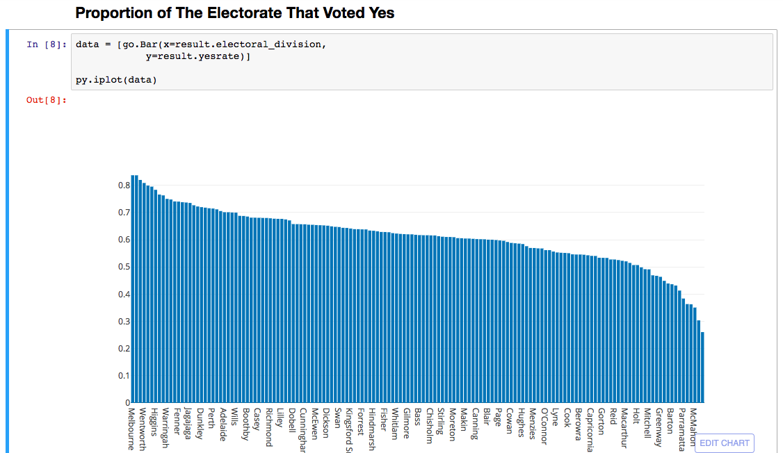
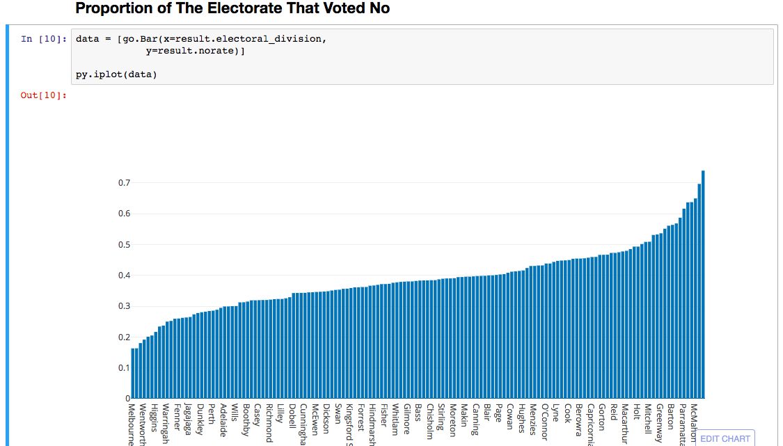
While you’re at it, create a plot of no voters.
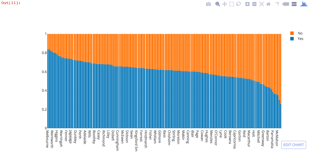
And finally, create a stacked plot of yes and no votes. This is a little trickier. When using plotly you need to create a separate trace for each data series. In this case we’ve set trace1 to yes votes and trace2 to no votes. These series are then passed to the data array.

6. Get Mapbox Access and token
In order to display points on a map we need to convert electoral divisions to coordinates. We can do this using the Google geocoder library and looping through each electoral division within our data frame.
Side Note: this tends to be a finicky process due to query limits. If you can’t be bothered you can use the data frame that I prepared earlier. Just add the following line to your notebook.
result = pd.read_csv(‘https://raw.githubusercontent.com/nicknochnack/plotly_dash_viz/master/geocodeddf.csv’)
Side-Side Note: THE GEOCODING IS NOT CORRECT but you get the idea. I spent the last three hours trying to beat Google’s Over Query Limit status to no avail. I’ll fix this up as soon as I work it out!
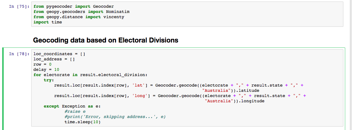

If you’re up for the geocoding challenge then full steam ahead. Run the code to geocode each electoral division. Your data frame will now contain two new columns with latitude and longitude of each region.
Get an Acess token from mapbox by going here>> https://www.mapbox.com/studio/account/tokens/
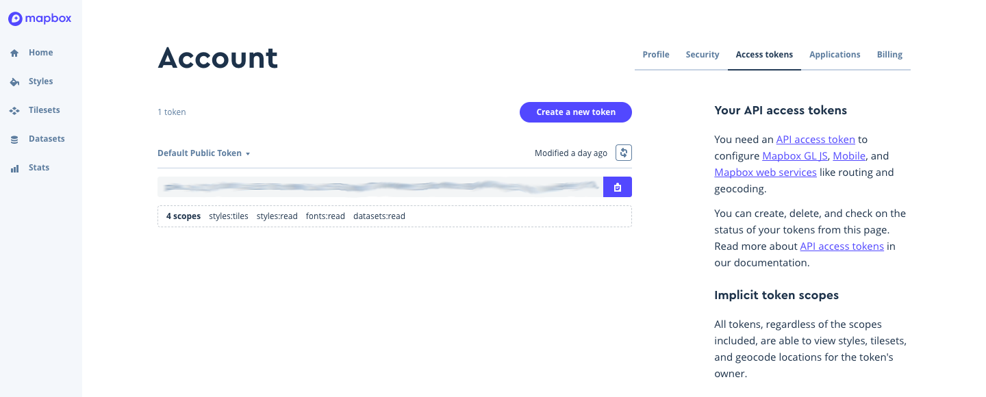
Copy down the Access token, you’ll need it to create your atlas graph.
7. Plot an atlas graph
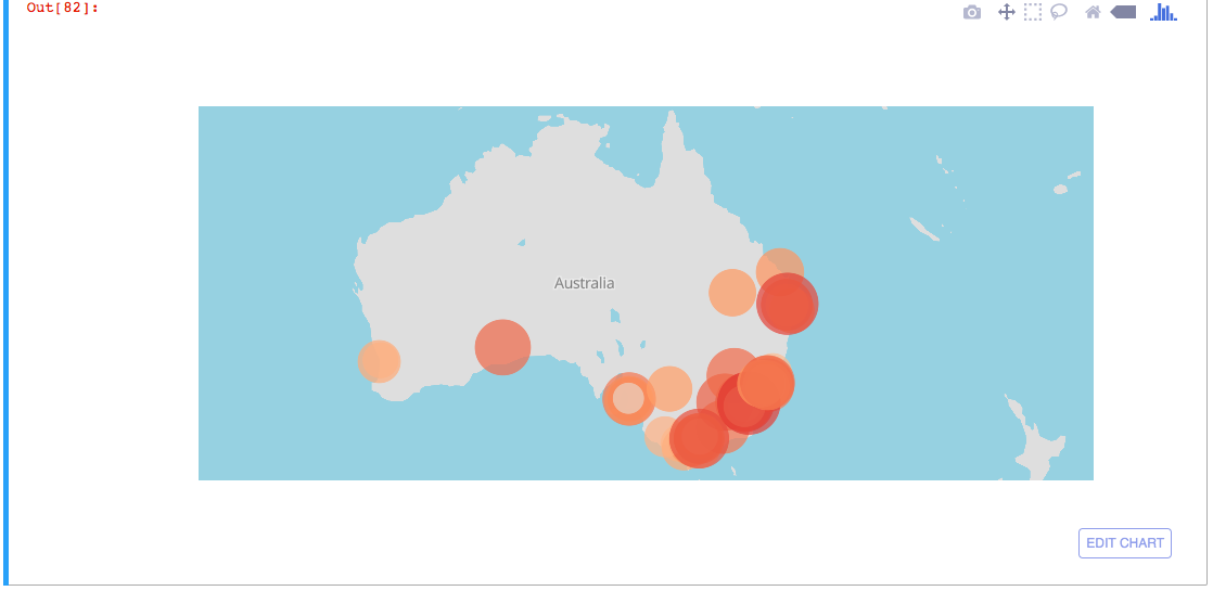
It doesn’t look like there is support for an Australian choropleth (yet) but you can still narrow down the world map to Australia. This is how this example has been weaved together.
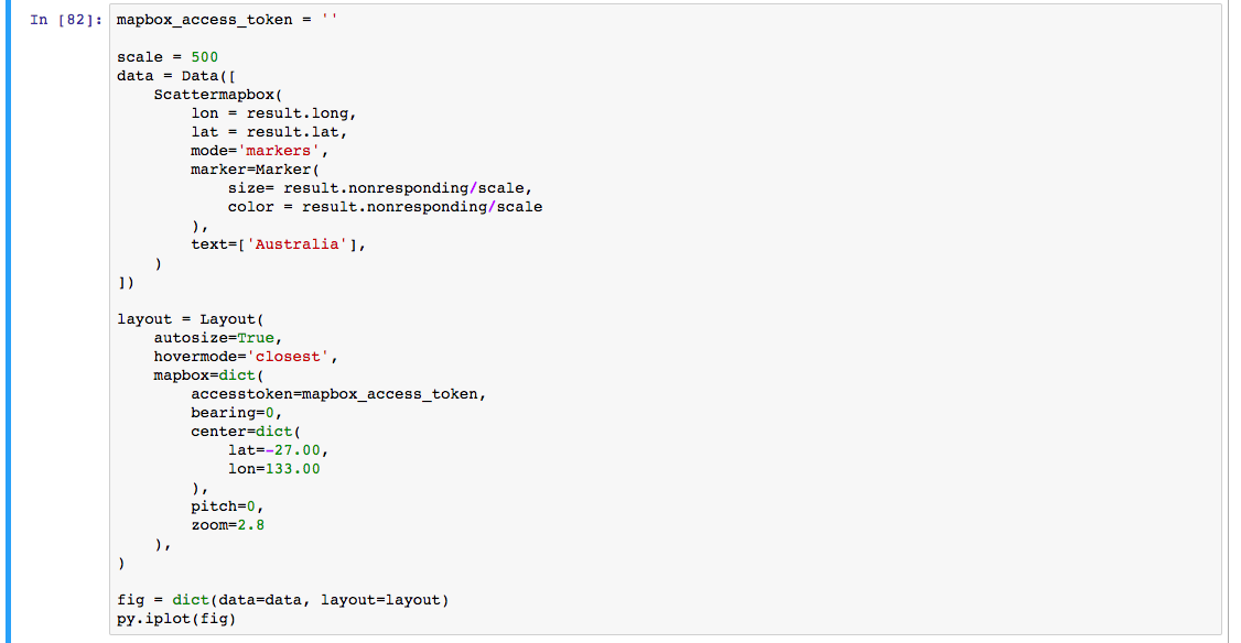
And voila, interactive atlas viz. Remember with each one of these plots you’re able to hover over the data points, zoom, and select regions!
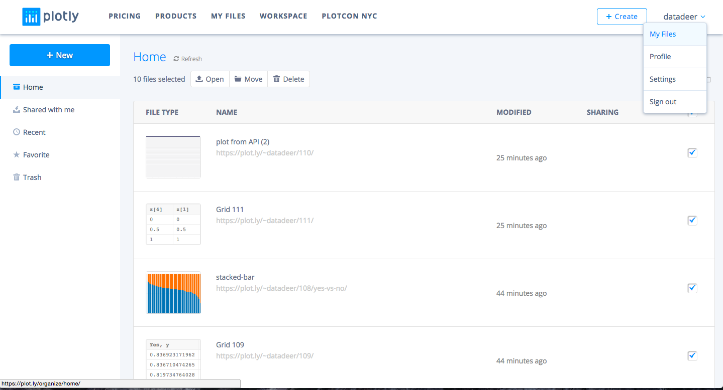
Side Bar: If you get an error saying you have too many graphs you can get around it by just deleting the old graphs that you have created.
